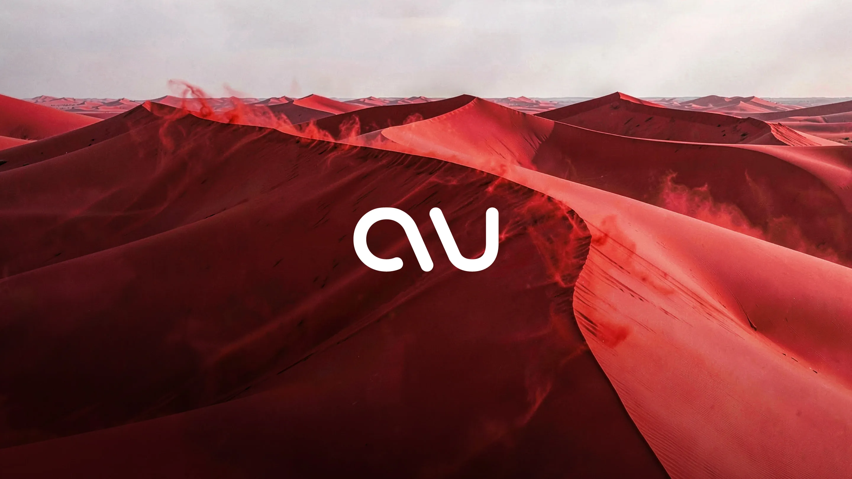
The studio’s own brand: a new name, a logotype drawn for it and a complete brand system, from strategy to the website you are reading.
The challenge
The studio’s first name turned out to be a registered trade mark in Europe. Starting again meant more than finding a new word. We needed a name of our own, a brand that reads as a senior studio rather than a travel diary, and a system that works on screen, on paper and on social from day one.
The approach
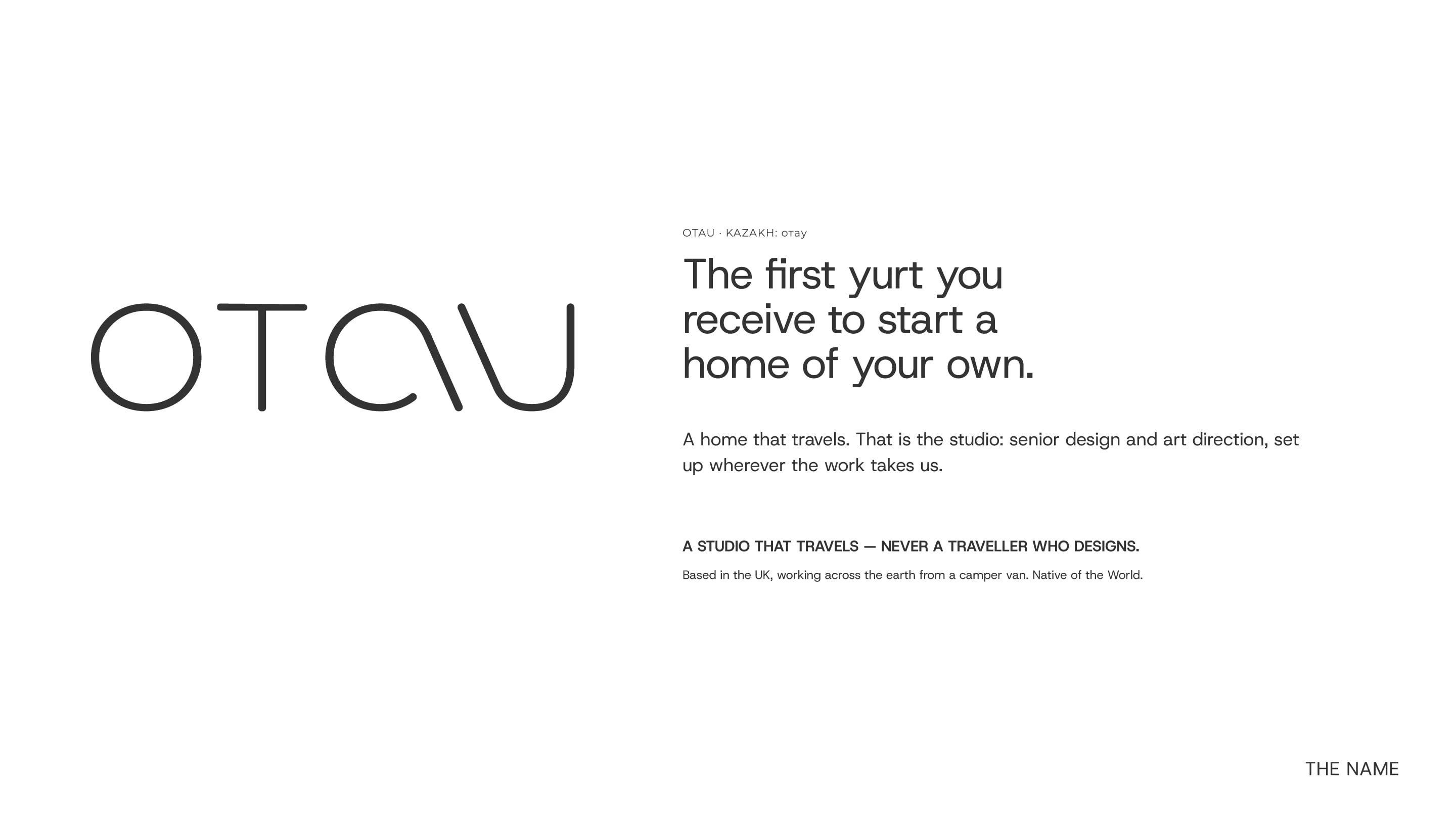
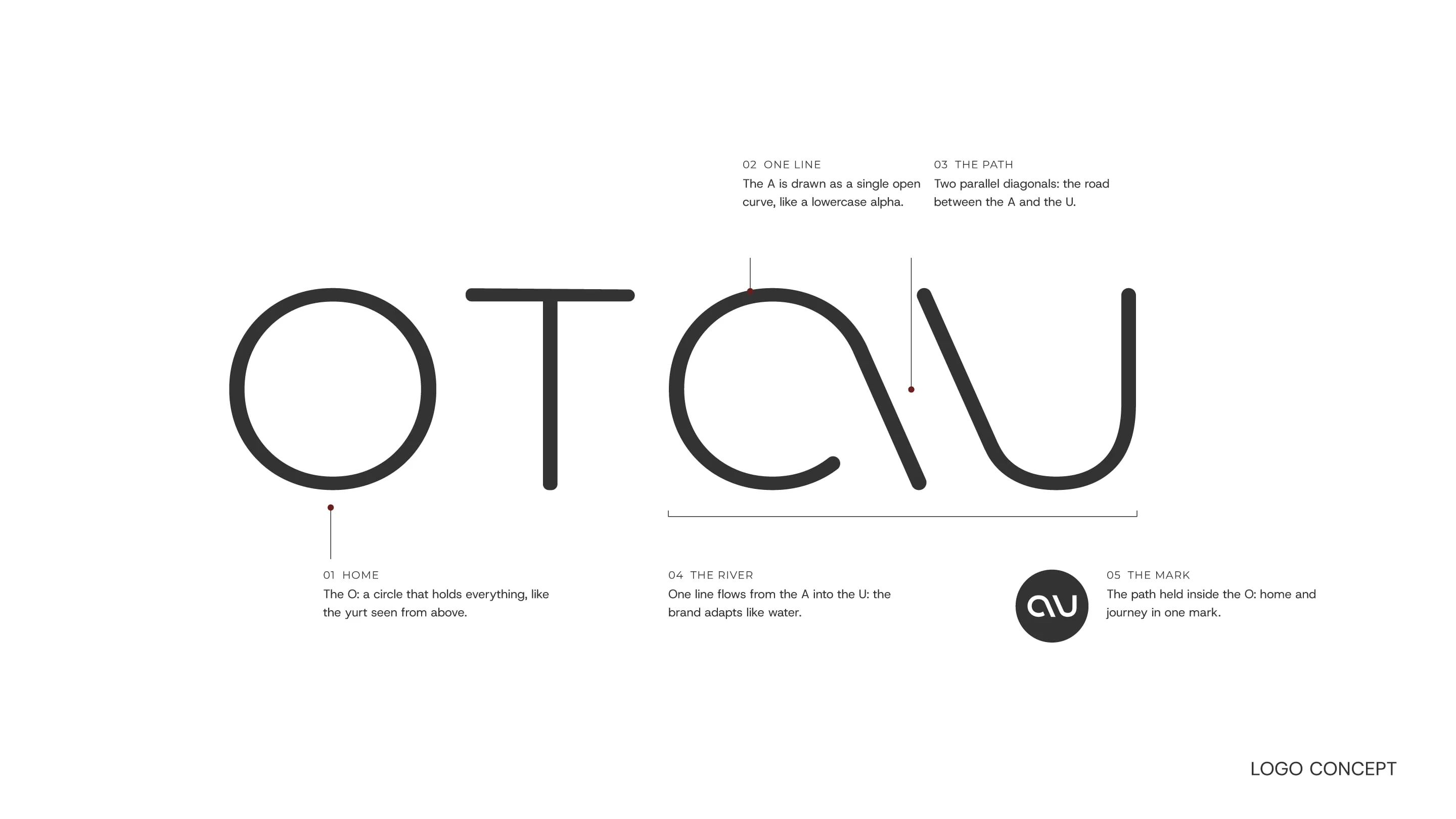
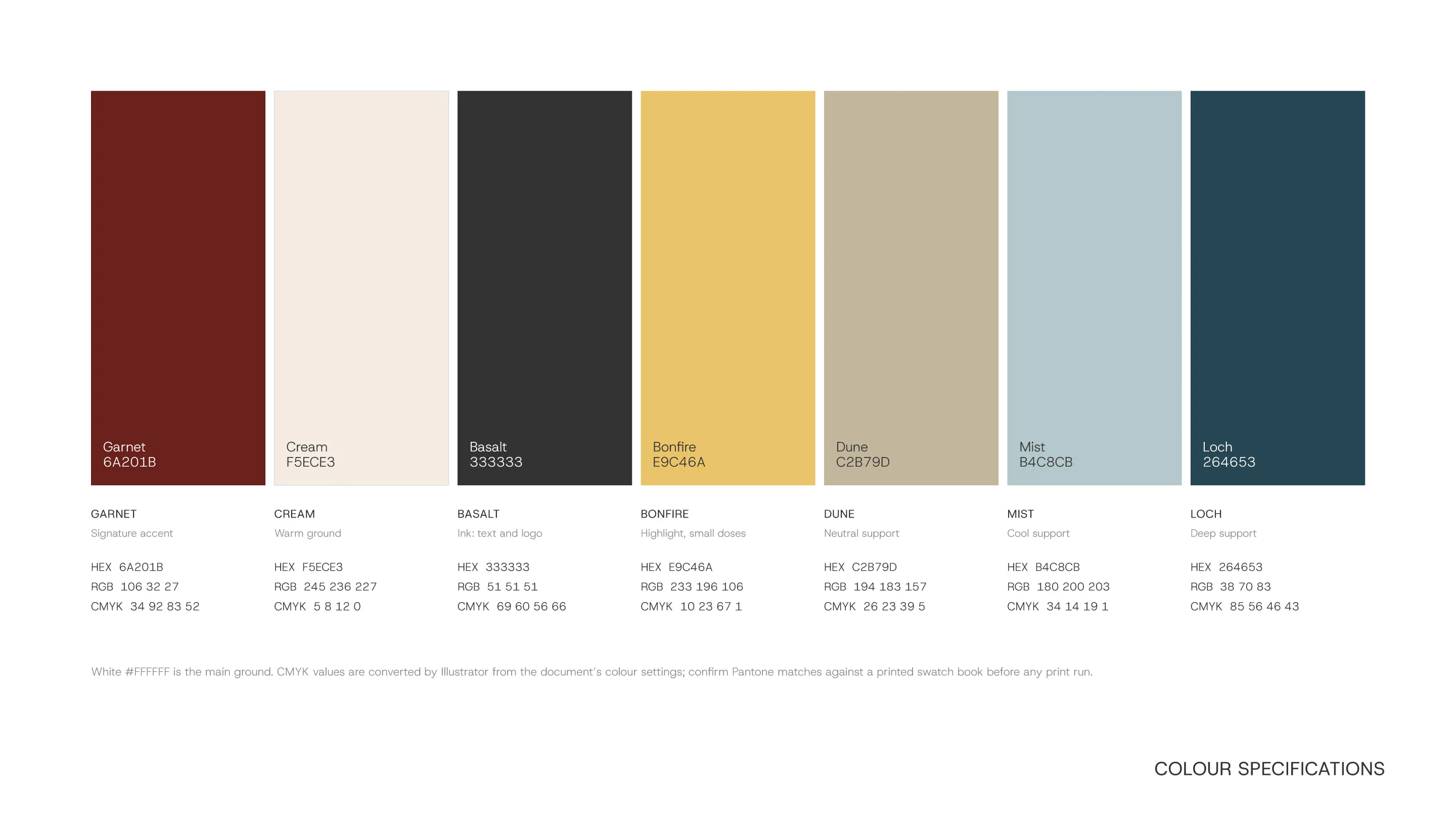
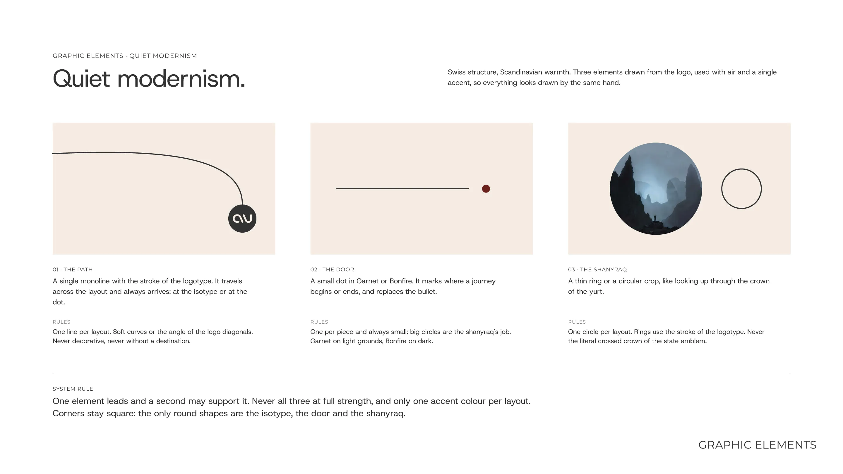
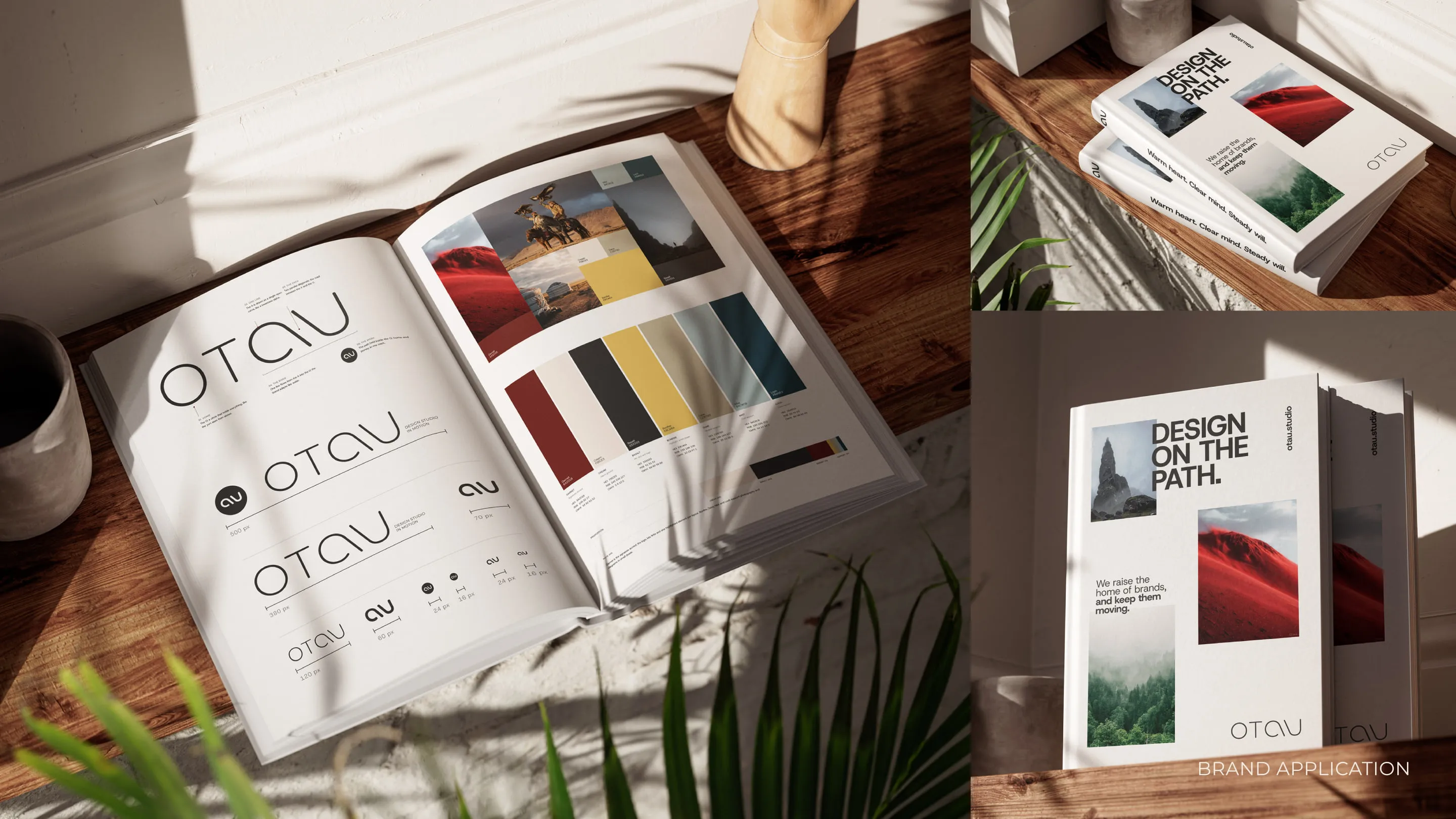
We started with strategy: positioning, a brand platform and a tone of voice. The name comes from Kazakh: an otau is the first yurt a young couple raise together, their first home of their own. That gave us the idea, a home that travels, and the tagline, “Home is the path.” The logotype is a thin monoline drawn for the brand, where two parallel diagonals trace the path. Around it sits a calm system: Swiss structure, Scandinavian warmth, a Cream ground, Basalt ink and Garnet as the only accent.
What we delivered
- Strategy: positioning, brand platform, archetype and tone of voice
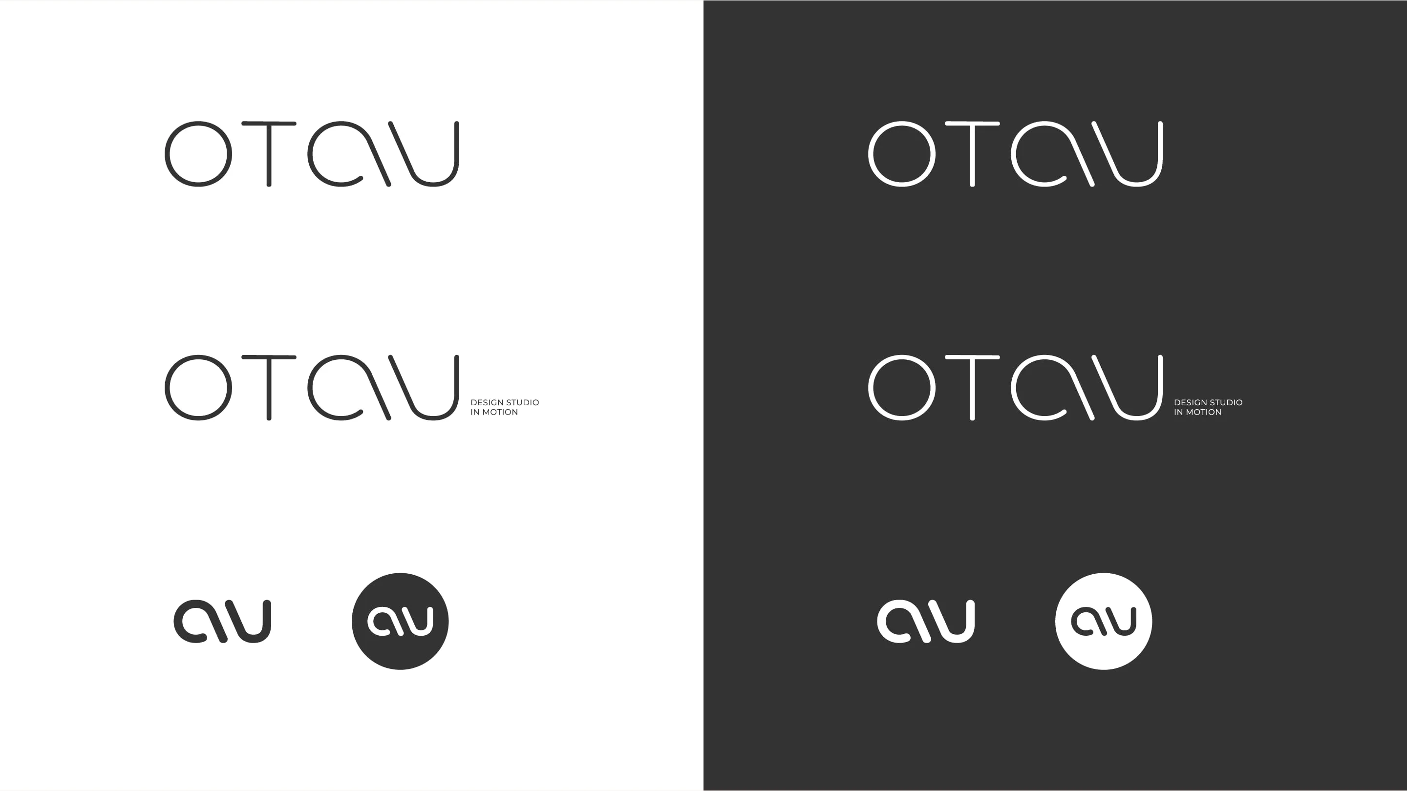
- Name, logotype, lockup and isotype
- Colour, typography, grid and graphic elements
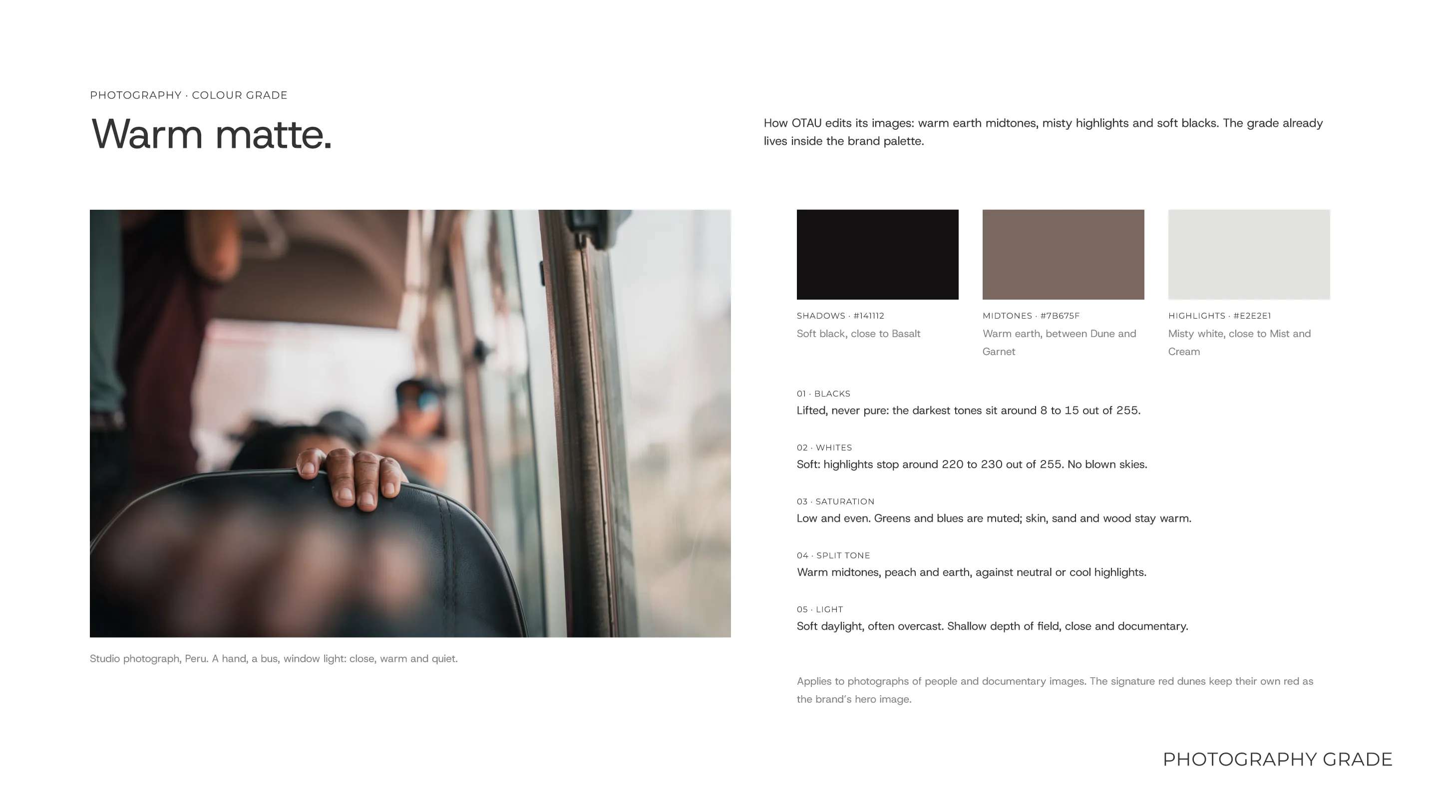
- Photography direction and Warm matte, the studio’s own colour grade
- A brand guide of more than 40 pages and a 50-file brand kit
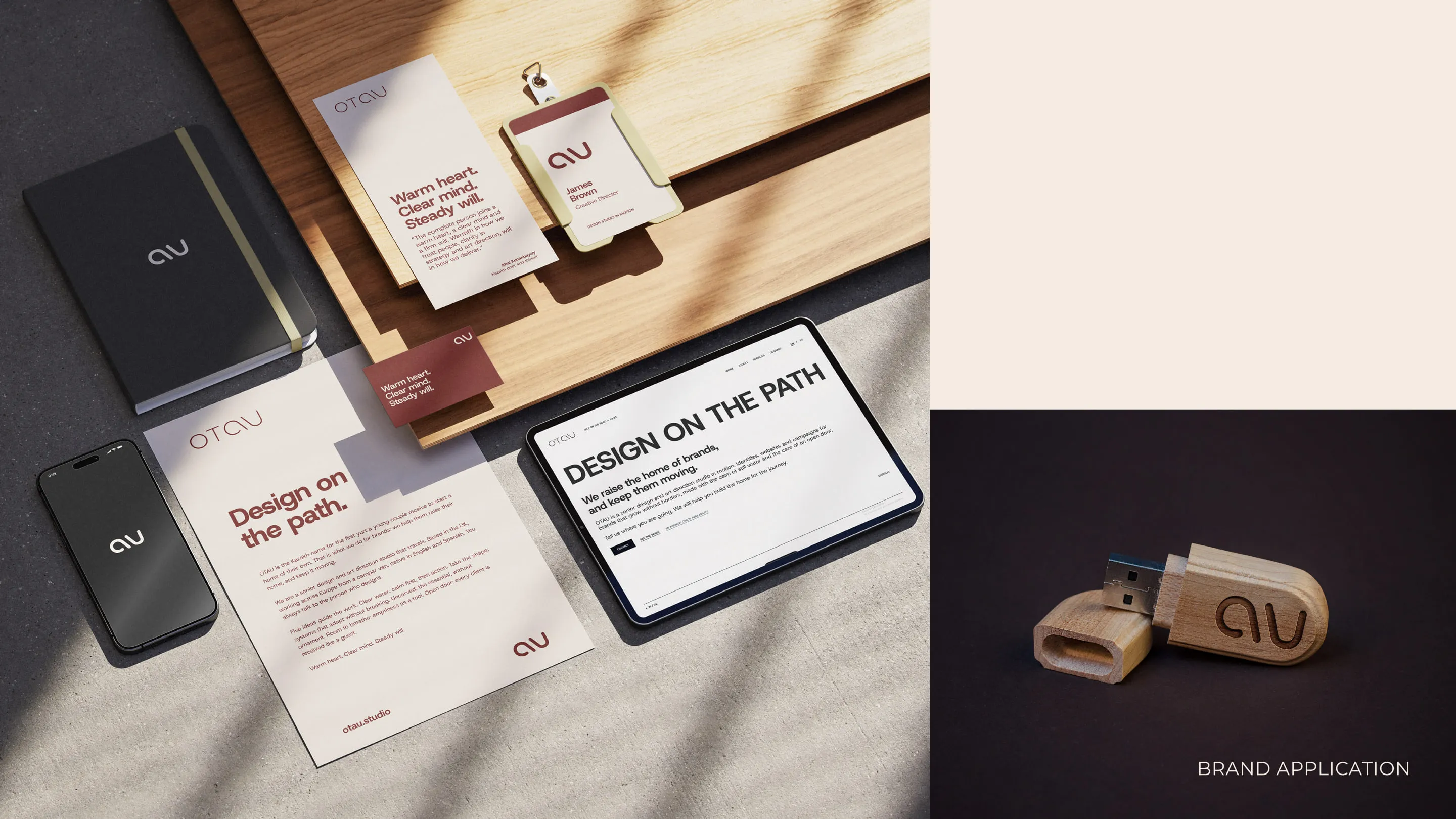
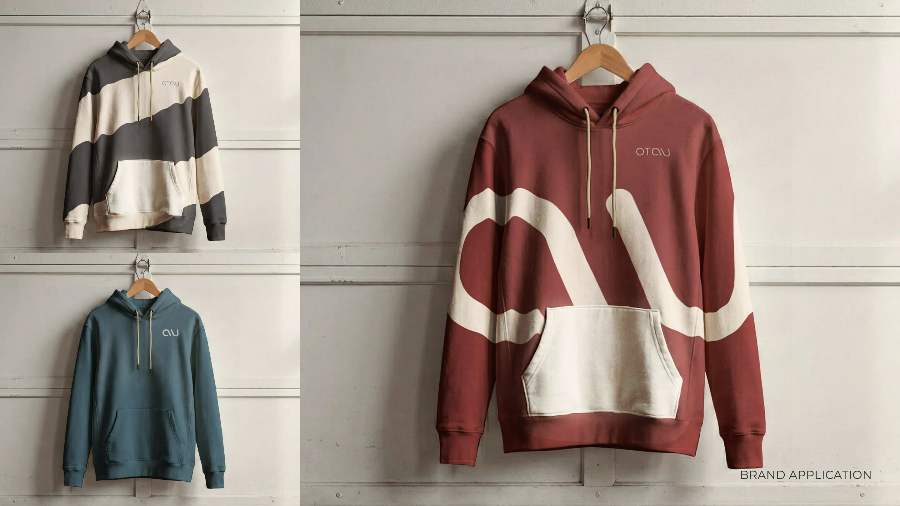
- Print, digital and social templates, motion principles and this website
The result
OTAU now has a name of its own and one system for everything, from a business card to a reel. This website is its first application. It is our own project, so the proof is what you are looking at.
More from the project
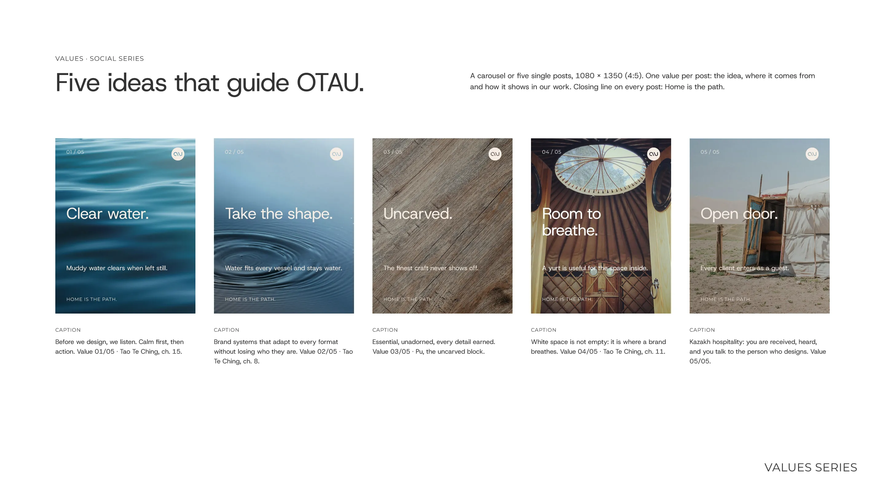
Mission, vision and values
Drawn from Taoism and Kazakh hospitality.
- Mission: We raise the home of brands, and keep them moving.
- Vision: Home is the path.
- Values: Clear water · Take the shape · Uncarved · Room to breathe · Open door.
- Personality: Warm heart. Clear mind. Steady will.