Brand identity for a cloud and software consultancy born in Gran Canaria, built from the foundations up: strategy, a logotype drawn on a modular grid, colour, type and the guidelines that hold it together.
The challenge
Nubyron is a technology company born in Gran Canaria, specialising in software consultancy and development across Azure, Google Cloud and AWS. It works as a close partner to ambitious businesses, and it needed a brand as precise as its engineering and as close as its way of working.
The approach
I built it from the foundations up. Mission, vision, values and audience came first. Then a logotype drawn on a construction grid, a black, cyan and purple colour system with its gradients, Unbounded and Space Mono as the type pair, and the rules that keep it all consistent.
Logotype
Built from modules, like the cloud
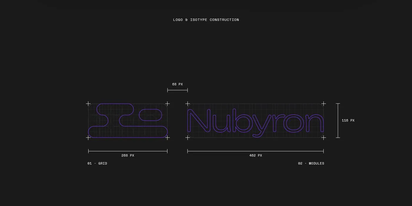
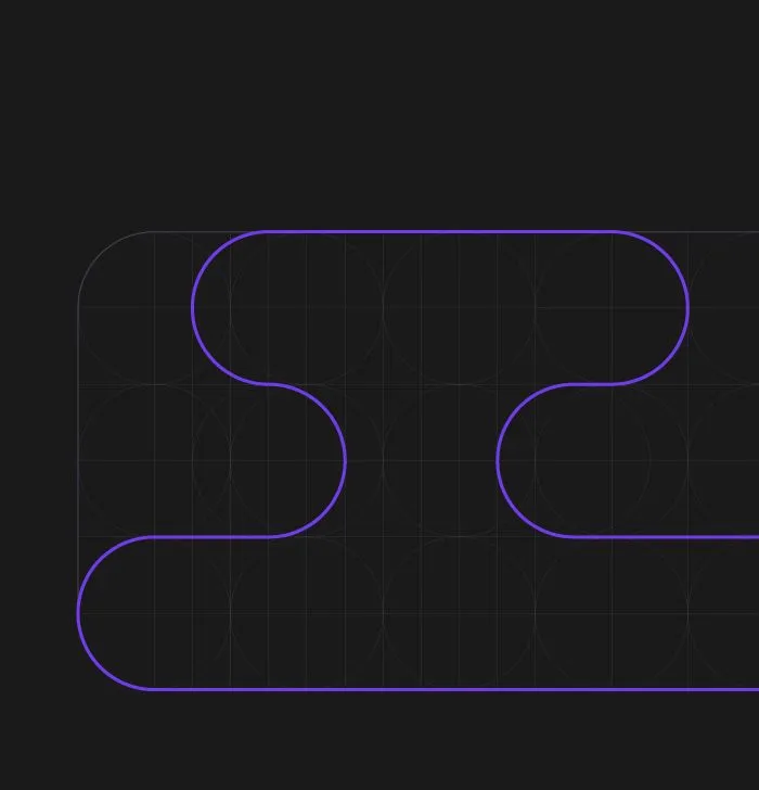
The logotype is built from modules on a grid, like the cloud infrastructure Nubyron designs: separate pieces that fit together into one system.
Colour
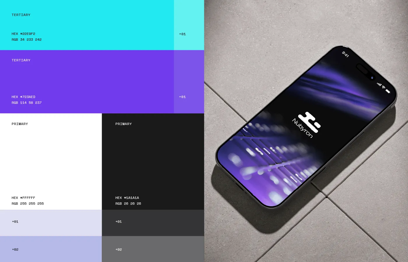
Black, cyan and purple
Black and white, with cyan and purple as accents, each with its tints and gradients.
Typography
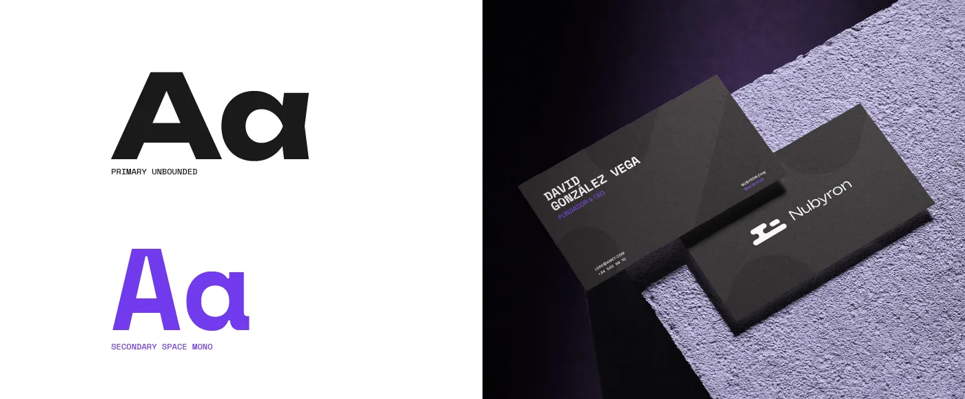
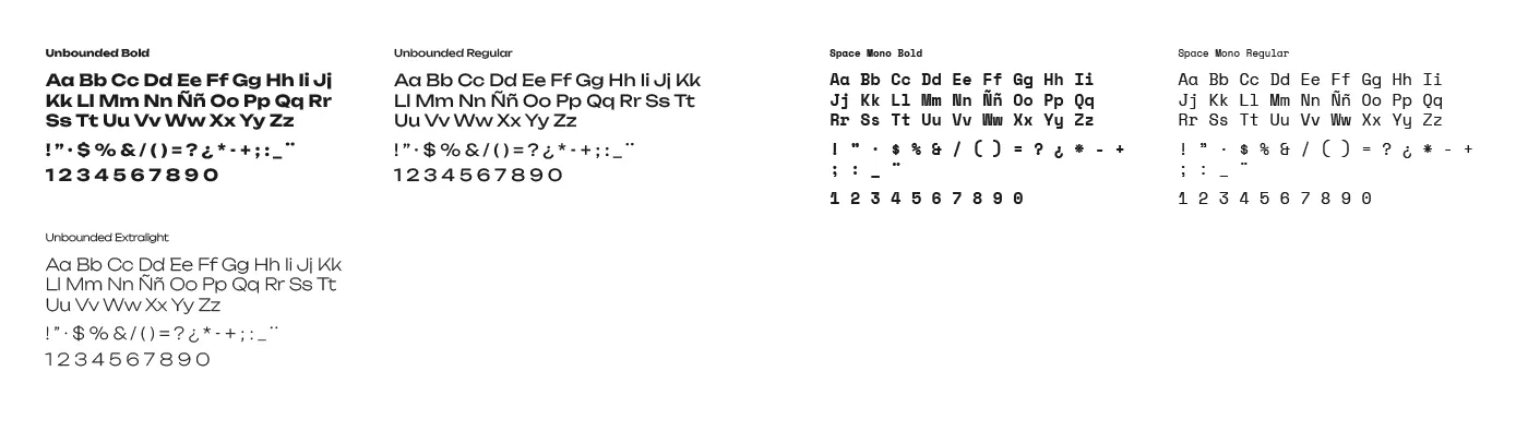
Unbounded and Space Mono
Unbounded for presence, Space Mono for the language of code.
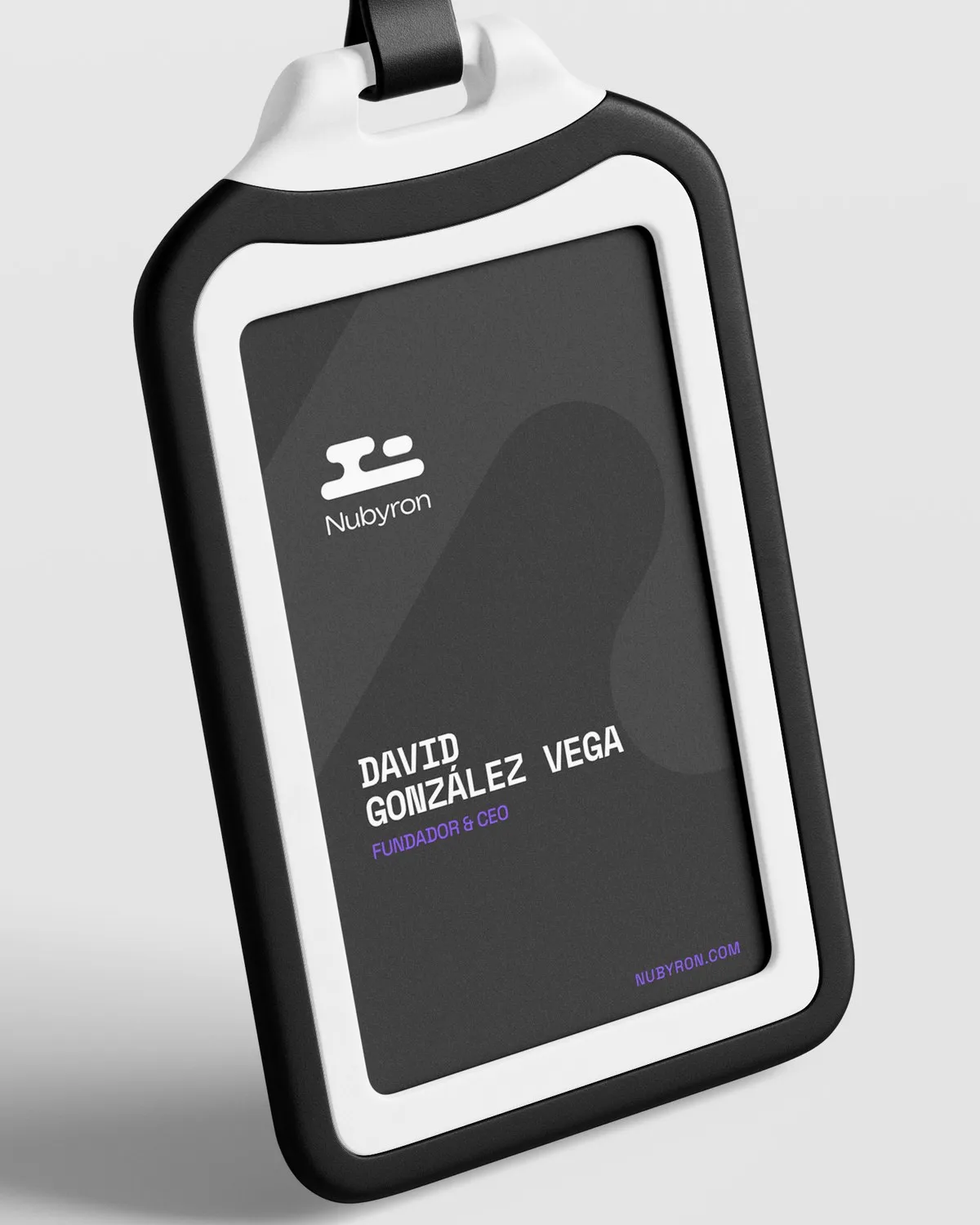
Applications
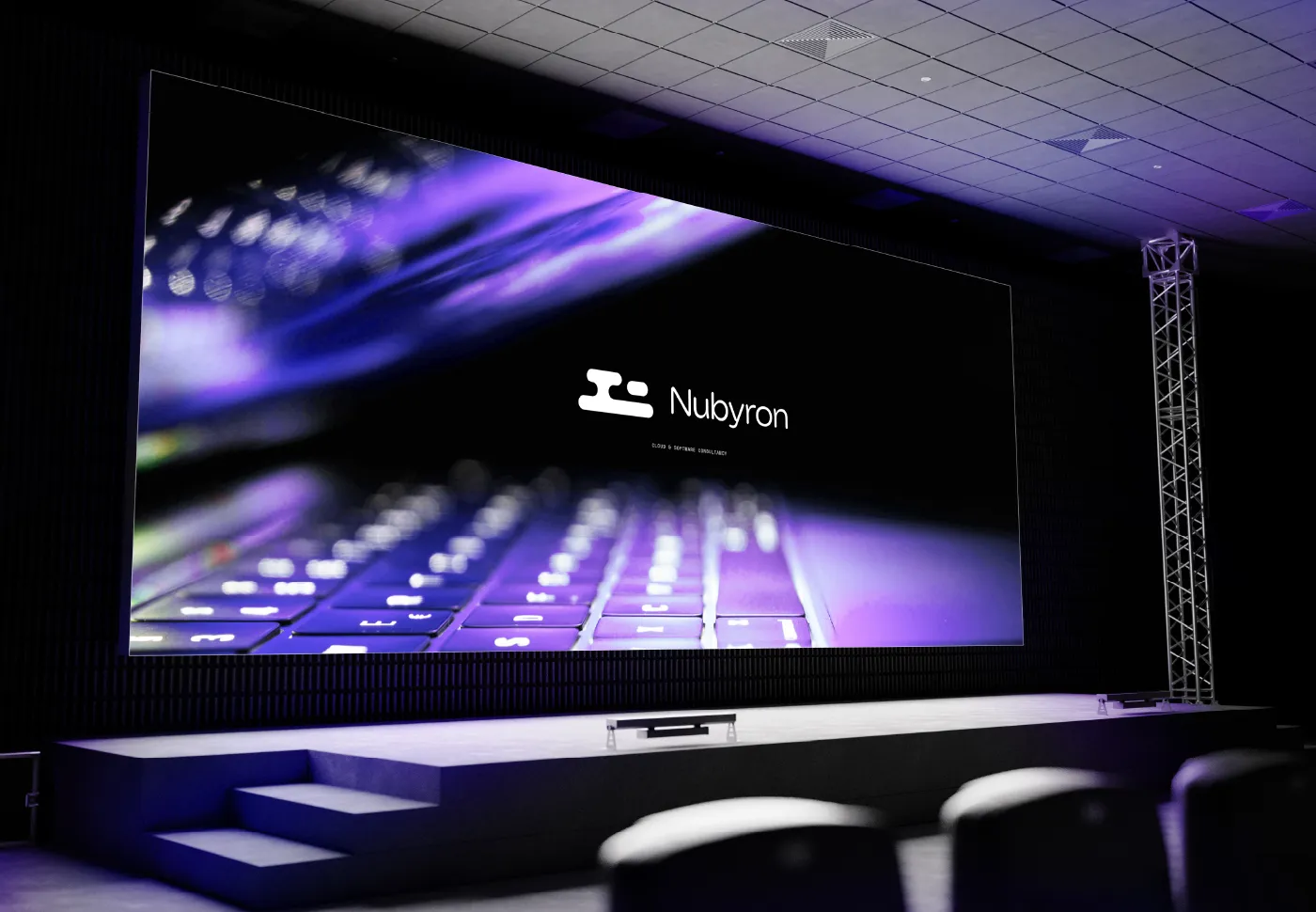
From the card to the big screen
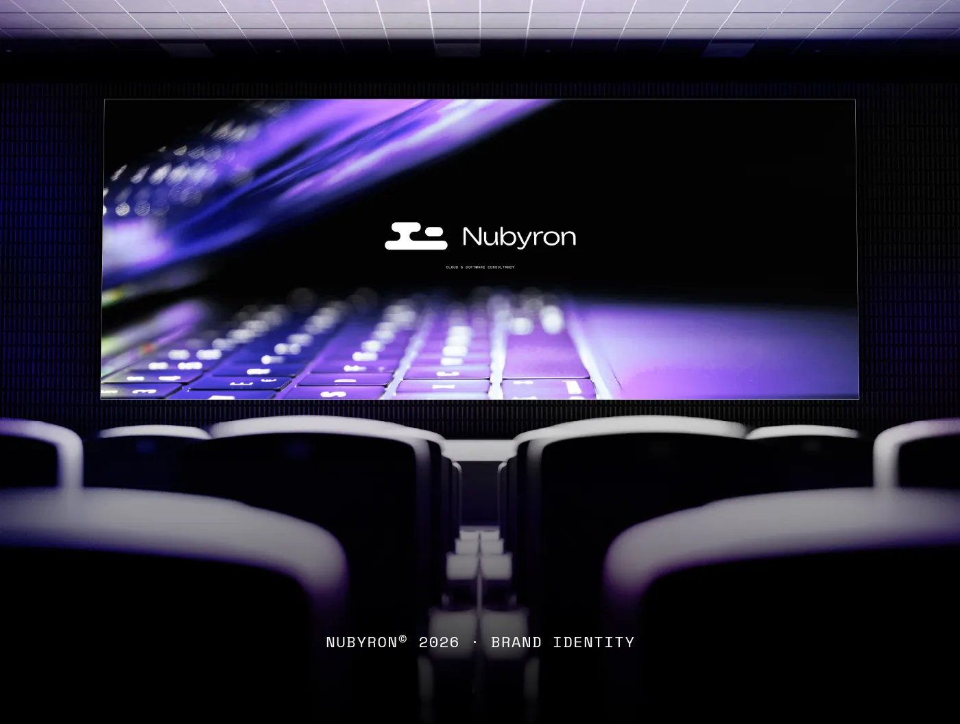
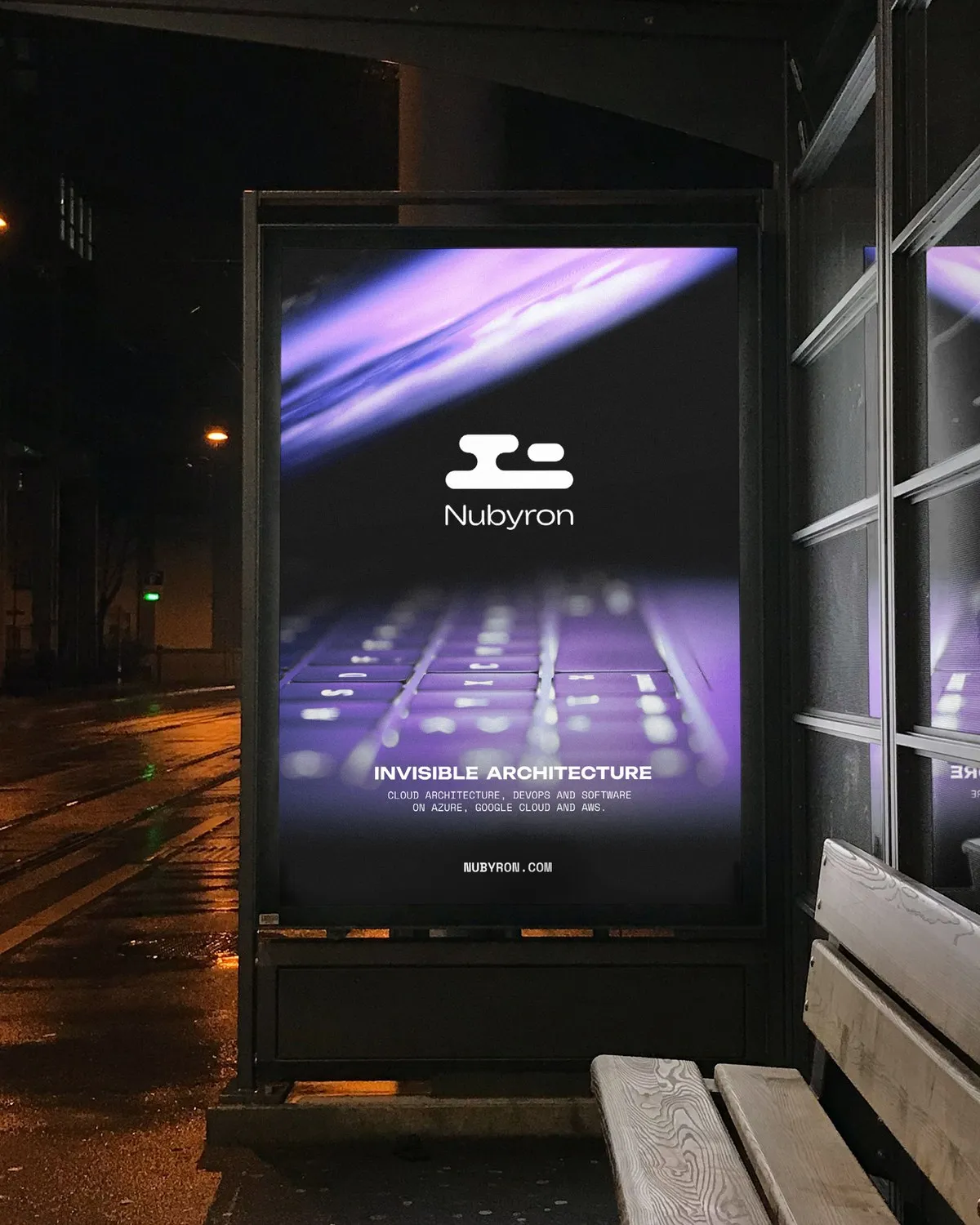
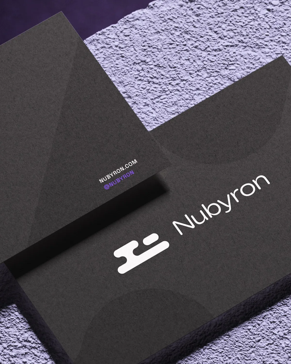
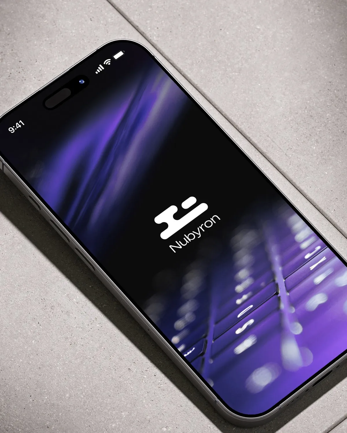
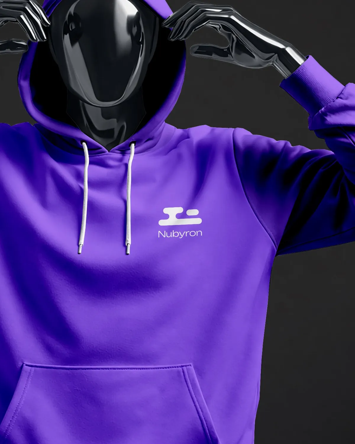
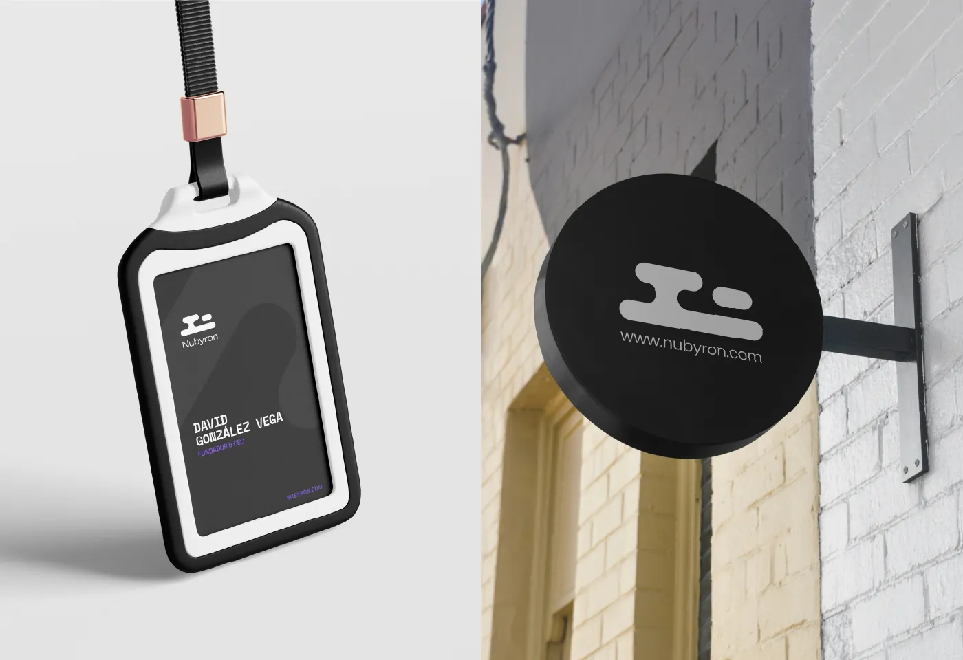
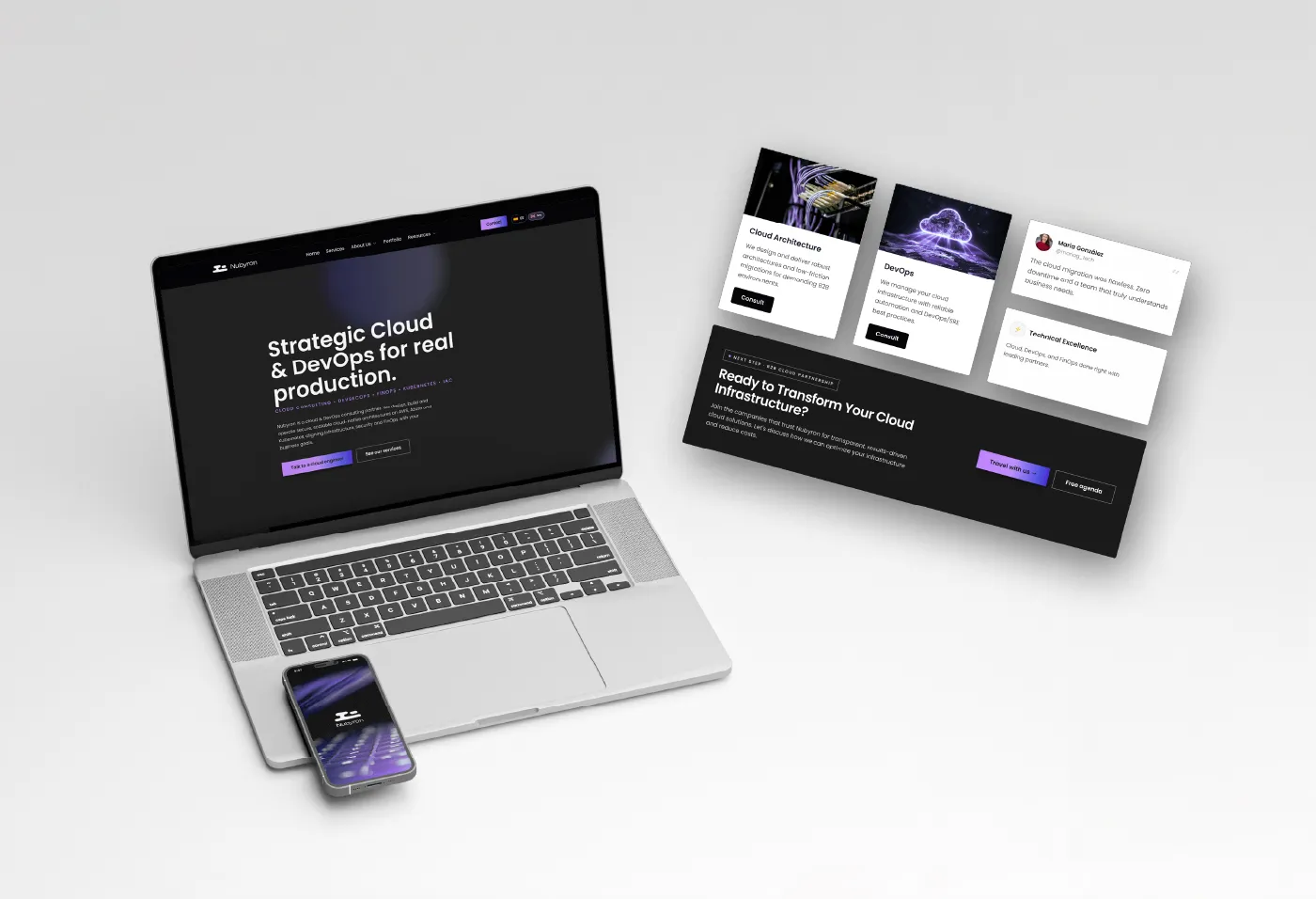
From business cards and signage to a bus-shelter poster and a website concept.
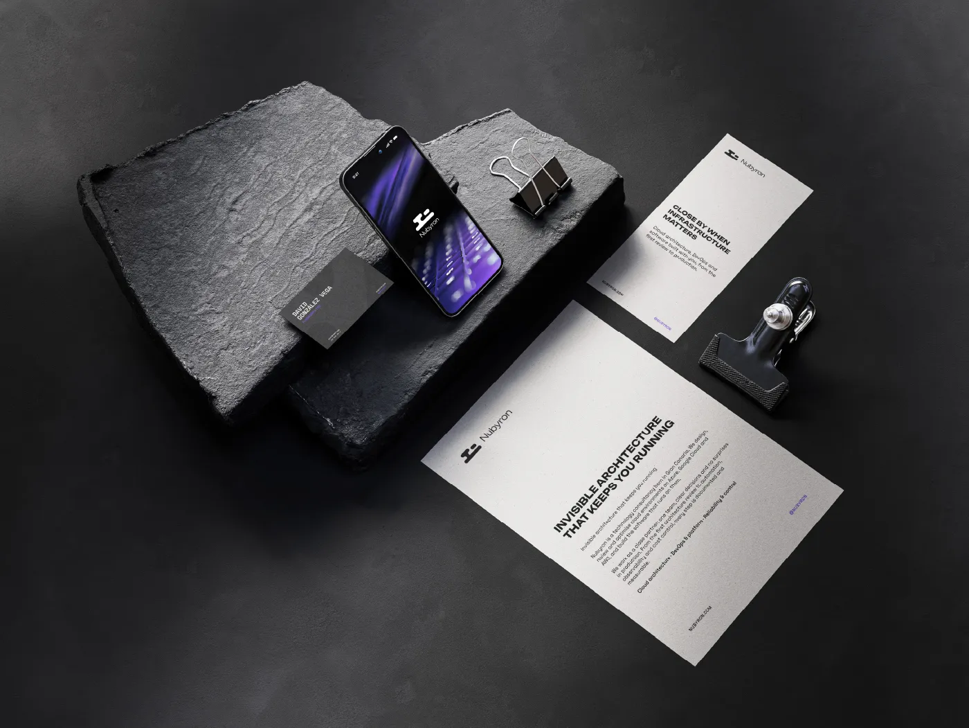
What we delivered
- Brand platform: mission, vision, values and audience
- Logotype and isotype built on a modular construction grid
- Colour system with primary, accent and complementary colours and gradients
- Typography: Unbounded and Space Mono
- Brand guidelines with correct and incorrect uses
- Applications: business cards, signage, a bus-shelter poster and a website concept
The result
A complete brand guide that brings the system together, from business cards and signage to a bus-shelter poster and a website concept.